Description
Turn data into clear, purposeful visual stories
Effective data visualization involves more than producing attractive charts. You need to define the audience and analytical question, select an appropriate visual form, use colour and annotation deliberately, check that the chart represents the data honestly, and communicate what the evidence can—and cannot—support.
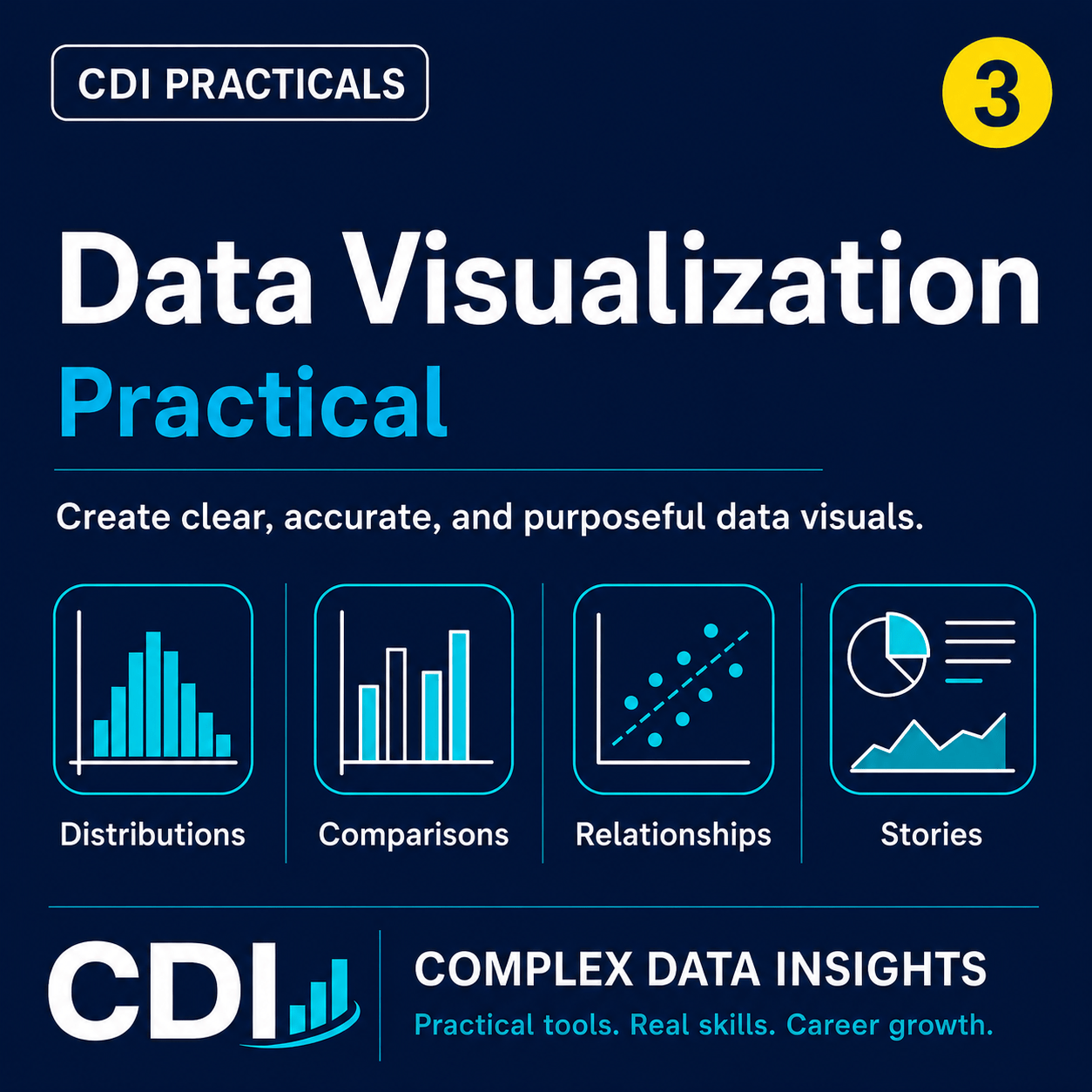
In this hands-on CDI Practical, you will use Python to complete an end-to-end data visualization project with a realistic synthetic service-delivery dataset. You will move from a documented visualization plan to reproducible comparison, distribution, relationship, composition, and time-series charts, followed by critique, refinement, quality checks, and a professional visual evidence package.
By the end, you will have completed a responsible visualization workflow and created clear, accessible, reproducible charts supported by chart-data tables, design decisions, limitations, and portfolio-ready evidence.
What you will practise
- Defining the audience, analytical question, and intended message
- Planning charts and selecting effective visual encodings
- Creating comparison, distribution, relationship, composition, and time-series charts
- Using colour purposefully and accessibly
- Writing clear titles, labels, captions, and annotations
- Using small multiples to support comparison
- Checking time-series continuity before connecting observations
- Critiquing and improving chart designs
- Building an accessible visual summary
- Recording visualization decisions, limitations, and quality checks
- Exporting and verifying reusable figures and supporting data
What you will produce
- A documented visualization plan and decision log
- Comparison, distribution, relationship, composition, and time-series charts
- An annotated follow-up chart and small-multiples display
- An accessible visual summary
- Reusable chart-data tables and exported figures
- Visualization quality checks and a reproducibility manifest
- A portfolio-ready project summary and evidence package
What is included
- A browser-based, step-by-step CDI Practical
- A realistic synthetic cleaned service-delivery dataset
- Complete Python code used throughout the guided practical
- Guided questions, design prompts, critique activities, and professional decision points
- Author-generated reference figures, chart-data tables, and quality-control outputs
- A requirements file for creating a dedicated Python environment
- Access through the download links supplied after purchase
- The option to save a personal PDF copy using your browser’s Print → Save as PDF feature
Who this practical is for
- Data science and data analysis learners
- Students and researchers working with tabular data
- Monitoring, evaluation, and programme professionals
- Professionals strengthening their visual communication skills
- Learners building credible evidence for a data portfolio
What you need
- Python 3.10 or later
- VS Code with the Python and Jupyter extensions, or another Python environment
- Basic familiarity with Python and tabular data
- No advanced statistics or visualization experience
Important information
The practical uses synthetic data created for learning. It contains no real participant or client records.
Visual patterns are communicated as descriptive evidence and are not treated as proof of causation.
This is a digital product. No physical item will be shipped.